Product
Mobile App
Timeline
2 Weeks
My Role
Product Designer / UX Designer
Impact
Time spend increased by 114% & Increase in GMV : yet to measure
In today's fast-paced world, many people own their own businesses. Their main struggle is finding clients to sell their products or services. Today, there are many lead-finding tools based on Google My Business. Lead Finder is one app in this category.
Project Overview
This project re-imagines the traditional lead-finding experience by transforming a manual Google Maps-based search workflow into an intelligent, AI-driven system that understands user intent and automates discovery. The new system leverages conversational AI, predictive analytics, and lead scoring to help users find high-quality business leads faster and more accurately than before.
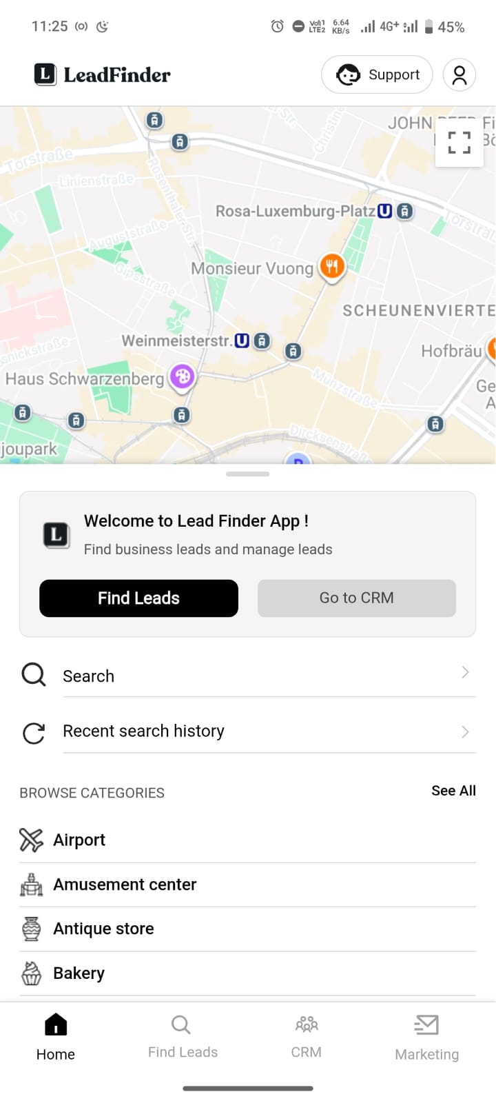
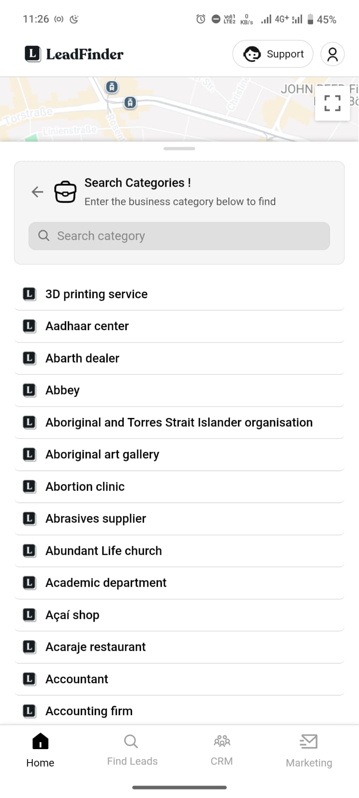
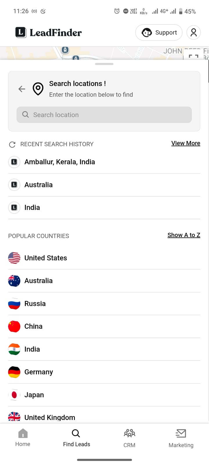
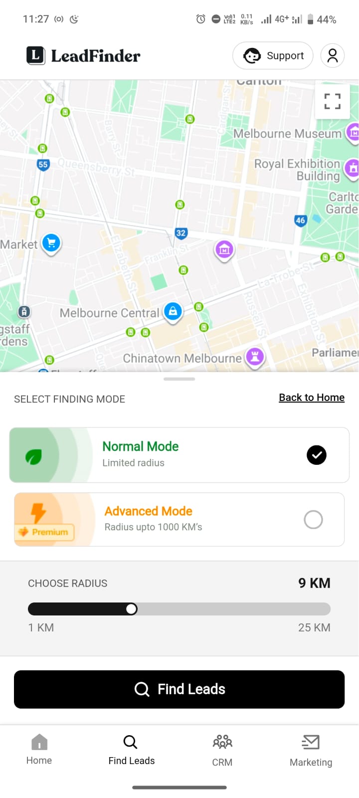
Current App User-Flow Screenshots
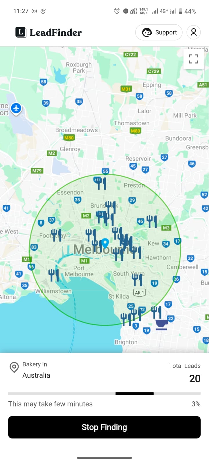
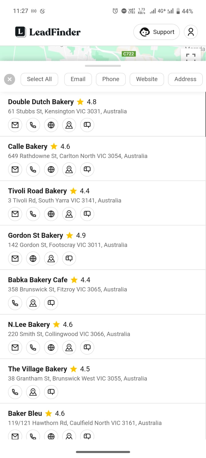
Problem with current app flow
Slow Search Flow
In the old design, the menu was placed in the footer, which worked at that time, so we didn’t want to distract or confuse users.
High Cognitive Load
A long, unstructured list of categories increases cognitive load and can confuse users instead of guiding them.
High Cognitive Load
In the old design, the menu was placed in the footer, which worked at that time, so we didn’t want to distract or confuse users.
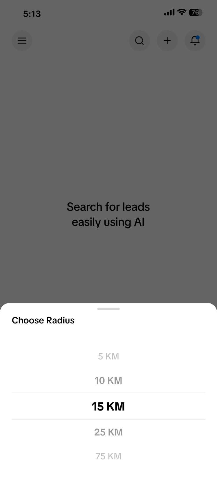
The query customization
To fine-tune their search, users have to go through 3–4 screens, and once they’re there, they can’t change their niche without going all the way back to the first step. It feels slow, frustrating, and breaks their flow.
User interview💬
In the old design, the menu was placed in the footer, which worked at that time, so we don’t want to distract or confuse users.
Finding the right category takes time because there are too many options without any guidance.
Once I reach the filter screen, I can’t change my niche unless I go back again.
Sometimes I don’t even know which type of business I should search for.
I just want to type what I need and get leads quickly.
Approaching the solution ➡️
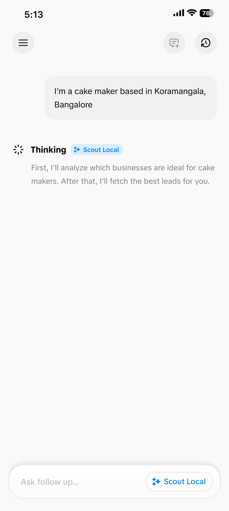
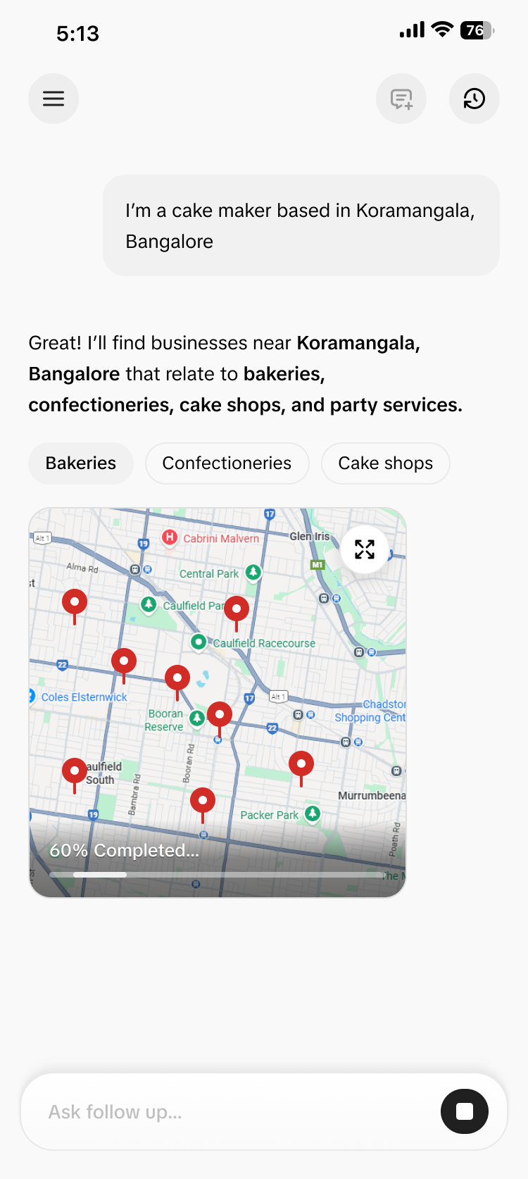
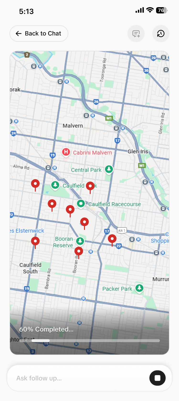
We plan to revamp the app and make it fully AI-powered. Our goal is to turn it into a “ChatGPT for lead generation.” That’s why we chose a chat-based UI that closely mirrors ChatGPT’s interface. Most users are already familiar with this pattern, which lowers the learning curve and makes the experience feel instantly intuitive. This decision is also guided by Jakob’s Law, which states that users spend most of their time on other products and expect new interfaces to behave in similar ways. By using a familiar chat layout, we reduce friction and help users focus on what matters — finding the right leads. Since users often need assistance for every lead query, a conversational interface allows the AI to guide, clarify, and refine results in real time. Compared to traditional dashboards and filters, the chat UI offers a more natural, flexible, and efficient way to discover high-quality leads.
The final outcome after redesign
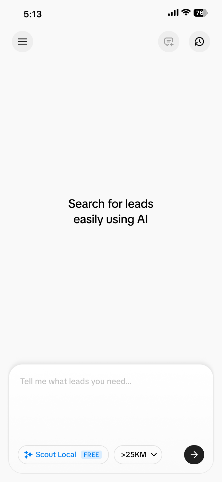
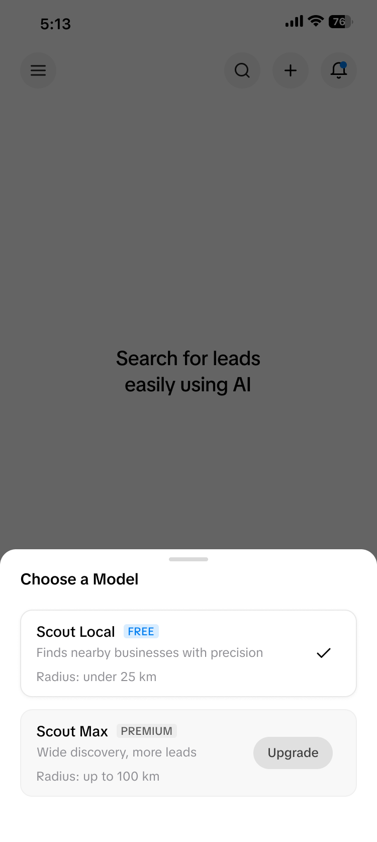
The Impact of the Redesign
The shift to an AI-powered, chat-based interface significantly improved how users discover and qualify leads. By removing complex filters and replacing them with natural conversations, users were able to find relevant leads faster and with less cognitive effort. New users no longer felt lost when choosing categories or locations, because the AI actively guided them through the process. At the same time, experienced users could jump straight to their high-performing lead types by simply asking for them in plain language. The familiar ChatGPT-style interface reduced onboarding friction and increased user confidence, since people already knew how to interact with it. This led to higher engagement, fewer abandoned searches, and more meaningful lead exploration. Overall, the redesign transformed lead finding from a manual, trial-and-error workflow into a guided, intelligent experience — making the platform feel more like a smart assistant than a traditional tool.